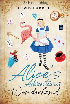
Alice's Adventures in a Dyslexic Wonderland
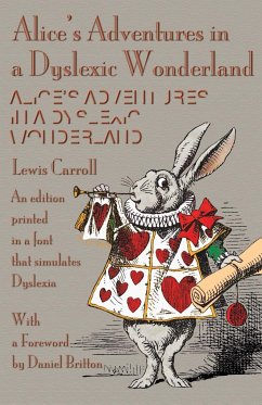
An edition printed in a font that simulates dyslexia
Versandkostenfrei!
Versandfertig in 1-2 Wochen
16,99 €
inkl. MwSt.

PAYBACK Punkte
8 °P sammeln!
In 2013, Daniel Britton initiated a project at the London College of Communication to recreate the feeling of reading with dyslexia-to try and instil a sense of empathy between non-dyslexics and dyslexics. To accomplish this, he designed a typeface that would be almost illegible and slow down the reading pace of a non-dyslexic person to the speed of a dyslexic, recreating the frustration and embarrassment of reading with the condition. Britton's typeface design doesn't simulate letters jumping around on the page or anything like that-it just breaks the reading time of a non-dyslexic down to th...
In 2013, Daniel Britton initiated a project at the London College of Communication to recreate the feeling of reading with dyslexia-to try and instil a sense of empathy between non-dyslexics and dyslexics. To accomplish this, he designed a typeface that would be almost illegible and slow down the reading pace of a non-dyslexic person to the speed of a dyslexic, recreating the frustration and embarrassment of reading with the condition. Britton's typeface design doesn't simulate letters jumping around on the page or anything like that-it just breaks the reading time of a non-dyslexic down to the speed of a dyslexic. With fonts specially produced by Michael Everson, this edition has been typeset in keeping with Britton's design objectives.


