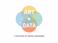
We all have endless tools that teach us how to use Tableau software. Blogs posts, user forums, and online tutorials teach the technical skills, but how do we learn to design dashboards that tell intuitive data stories? Art + Data is designed to help you think like a Data Artist and leverage visual best practices that best communicate your data story. At Decisive Data, we love uncovering new data stories with clients and finding solutions to their data quandaries. When we partner with new clients, we get an opportunity to help them visualize data in new ways. While unique data sets require an innovative approach to data visualization, we find that applying a consistent, specific methodology towards design helps us develop the highest quality work. All the dashboards in this book exemplify our method, which leverages our 5 Elements of Dashboard Design: Integrity, Flow, Color, Typeface and Charm. They vary in importance as a dashboard takes shape, but all are critical in assuring that a data story is told in a compelling, accurate and attractive way. We want our final dashboards to stand out. As you approach data visualization within your organization, we hope you'll find our methodology accessible and exciting. Use this book and the following dashboard examples to learn the 5 Elements and consider how they might apply in your industry. Imagine the possibilities for beautifully displaying your data story!
Hinweis: Dieser Artikel kann nur an eine deutsche Lieferadresse ausgeliefert werden.
Hinweis: Dieser Artikel kann nur an eine deutsche Lieferadresse ausgeliefert werden.

