- Broschiertes Buch
- Merkliste
- Auf die Merkliste
- Bewerten Bewerten
- Teilen
- Produkt teilen
- Produkterinnerung
- Produkterinnerung
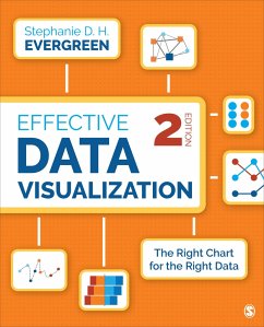
The updated Second Edition of the comprehensive how-to guide functions as a set of blueprints, supported by research and the authorâ s extensive experience with clients in industries all over the world, for conveying data in an impactful way.
Andere Kunden interessierten sich auch für
![Presenting Data Effectively Presenting Data Effectively]() Stephanie D. H. EvergreenPresenting Data Effectively80,99 €
Stephanie D. H. EvergreenPresenting Data Effectively80,99 €![The Data Visualization Sketchbook The Data Visualization Sketchbook]() Stephanie EvergreenThe Data Visualization Sketchbook49,99 €
Stephanie EvergreenThe Data Visualization Sketchbook49,99 €![10 Steps to Creating an Infographic 10 Steps to Creating an Infographic]() Stephanie B. Wilkerson10 Steps to Creating an Infographic80,99 €
Stephanie B. Wilkerson10 Steps to Creating an Infographic80,99 €![Qualitative and Mixed Methods Data Analysis Using Dedoose Qualitative and Mixed Methods Data Analysis Using Dedoose]() Michelle SalmonaQualitative and Mixed Methods Data Analysis Using Dedoose80,99 €
Michelle SalmonaQualitative and Mixed Methods Data Analysis Using Dedoose80,99 €![Statistics and Data Visualization Using R Statistics and Data Visualization Using R]() David S. S. Brown (University of Colorado, Boulder, USA)Statistics and Data Visualization Using R227,99 €
David S. S. Brown (University of Colorado, Boulder, USA)Statistics and Data Visualization Using R227,99 €![A Primer on Partial Least Squares Structural Equation Modeling (PLS-SEM) A Primer on Partial Least Squares Structural Equation Modeling (PLS-SEM)]() Joe HairA Primer on Partial Least Squares Structural Equation Modeling (PLS-SEM)77,99 €
Joe HairA Primer on Partial Least Squares Structural Equation Modeling (PLS-SEM)77,99 €![Multilevel Structural Equation Modeling Multilevel Structural Equation Modeling]() Bruno Castanho SilvaMultilevel Structural Equation Modeling49,99 €
Bruno Castanho SilvaMultilevel Structural Equation Modeling49,99 €-
-
-
The updated Second Edition of the comprehensive how-to guide functions as a set of blueprints, supported by research and the authorâ s extensive experience with clients in industries all over the world, for conveying data in an impactful way.
Hinweis: Dieser Artikel kann nur an eine deutsche Lieferadresse ausgeliefert werden.
Hinweis: Dieser Artikel kann nur an eine deutsche Lieferadresse ausgeliefert werden.
Produktdetails
- Produktdetails
- Verlag: SAGE Publications Inc
- 2 Revised edition
- Seitenzahl: 352
- Erscheinungstermin: 14. Mai 2019
- Englisch
- Abmessung: 230mm x 190mm x 12mm
- Gewicht: 642g
- ISBN-13: 9781544350882
- ISBN-10: 1544350880
- Artikelnr.: 55178041
- Herstellerkennzeichnung
- Libri GmbH
- Europaallee 1
- 36244 Bad Hersfeld
- gpsr@libri.de
Dr. Stephanie D. H. Evergreen is a sought-after speaker, designer, and researcher. She is best known for bringing a research-based approach to helping others better communicate their work through more effective graphs, slides, and reports. She holds a PhD from Western Michigan University in interdisciplinary research, which included a dissertation on the extent of graphic design use in written data reporting. Dr. Evergreen has trained audiences worldwide through keynote presentations and workshops for clients, such as Verizon, Head Start, American Institutes for Research, Brookings Institute, the Ad Council, Boys and Girls Club of America, and the United Nations. She led the first known attempt to revamp the quality of presentations for an entire association: the Potent Presentations Initiative for the American Evaluation Association (AEA). She is the 2015 recipient of the AEA's Marcia Guttentag Promising New Evaluator Award, which recognizes early notable and substantial accomplishments in the field. Dr. Evergreen is coeditor and coauthor of two issues of New Directions for Evaluation on data visualization. She writes a popular blog on data presentation at StephanieEvergreen.com. Her book, Presenting Data Effectively: Communicating Your Findings for Maximum Impact, was published by Sage in Fall 2013 and was listed as number one in Social Science Research on Amazon in the United States and United Kingdom for several weeks.
PREFACE
ACKNOWLEDGMENTS
ABOUT THE AUTHOR
Chapter 1. Our Backbone: Why We Visualize
Why We Visualize
When Visualization Is Harmful
Which Chart Type Is Best?
Tell a Story With Data
How to Use This Book
Exercises
Resources
References
Chapter 2. When a Single Number Is Important: Showing Mean, Frequency, and
Measures of Variability
What Stories Can Be Told With a Single Number?
How Can I Visualize a Single Number?
How Can I Show Measures of Variability?
Exercises
Resources
References
Chapter 3. How Two or More Numbers Are Alike or Different: Visualizing
Comparisons
What Stories Can Be Told About How Two or More Numbers Are Alike or
Different?
How Can I Visualize How Two or More Numbers Are Alike or Different?
Exercises
Resources
References
Chapter 4. How We Are Better or Worse Than a Benchmark: Displaying Relative
Performance
What Stories Can Be Told About How We Are Better or Worse Than a Benchmark?
How Can I Visualize How We Are Better or Worse Than a Benchmark?
Exercises
Resources
References
Chapter 5. What the Survey Says: Showing Likert, Ranking,
Check-All-That-Apply, and More
What Stories Can Be Told About What the Survey Says?
How Can I Visualize What the Survey Says?
Ranking
Branching
Visualizing Not Applicable or Missing Data
Exercises
Resources
References
Chapter 6. When There Are Parts of a Whole: Visualizing Beyond the Pie
Chart
What Stories Can Be Told When There Are Parts of a Whole?
How Can I Visualize the Parts of a Whole?
Exercises
Resources
References
Chapter 7. How This Thing Changes When That Thing Does: Communicating
Correlation and Regression
What Stories Can Be Told About How This Thing Changes When That Thing Does?
How Can I Visualize How This Thing Changes When That Thing Does?
Exercises
Resources
References
Chapter 8. When the Words Have the Meaning: Visualizing Qualitative Data
What Stories Can Be Told When the Words Have the Meaning?
How Can I Visualize When the Words Have the Meaning?
Pure Qualitative: Highlight a Word
Pure Qualitative: Thematic Analysis
Some Quantification: Highlight a Word
Some Quantification: Thematic Analysis
Exercises
Resources
References
Chapter 9. How Things Changed Over Time: Depicting Trends
What Stories Can Be Told About How Things Changed Over Time?
How Can I Visualize How Things Changed Over Time?
Exercises
Resources
References
Chapter 10. Reporting Out: Sharing Your Data With the World
Static Visuals
Interactive Dashboards
Exercises
Resources
References
Chapter 11. It's About More Than the Buttons
Dot Plots Generate Healthcare Pioneers
Clearly Labeled Line Graphs Streamline Decisions at a Fortune 500
Diverging Stacked Bars Make for Community Leaders in the Midwest
Icons Support Informed Policymaking
Building a Culture of Effective Data Visualization
Exercises
Resources
References
INDEX

