Ethan Watrall, Jeff Siarto
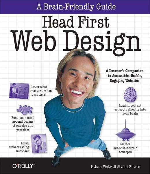
Head First Web Design
A Learner's Companion to Accessible, Usable, Engaging Websites
Ethan Watrall, Jeff Siarto
Head First Web Design
A Learner's Companion to Accessible, Usable, Engaging Websites
- Broschiertes Buch
- Merkliste
- Auf die Merkliste
- Bewerten Bewerten
- Teilen
- Produkt teilen
- Produkterinnerung
- Produkterinnerung
Want to know how to make your pages look beautiful, communicate your message effectively, guide visitors through your website with ease, and get everything approved by the accessibility and usability police at the same time? Head First Web Design is your ticket to mastering all of these complex topics, and understanding what's really going on in the world of web design.
Whether you're building a personal blog or a corporate website, there's a lot more to web design than div's and CSS selectors, but what do you really need to know? With this book, you'll learn the secrets of designing…mehr
Andere Kunden interessierten sich auch für
- Kenny WoodConfident Web Design57,99 €
- Adrian W. WestPractical Web Design for Absolute Beginners44,99 €
- Jonathan FieldingBeginning Responsive Web Design with HTML5 and CSS348,99 €
- Jeff SiartoHead First Wordpress31,99 €
- Jennifer Niederst RobbinsWeb Design in a Nutshell34,99 €
- Wendy ChisholmUniversal Design for Web Applications30,99 €
- Cal HendersonBuilding Scalable Web Sites35,99 €
-
-
-
Want to know how to make your pages look beautiful, communicate your message effectively, guide visitors through your website with ease, and get everything approved by the accessibility and usability police at the same time? Head First Web Design is your ticket to mastering all of these complex topics, and understanding what's really going on in the world of web design.
Whether you're building a personal blog or a corporate website, there's a lot more to web design than div's and CSS selectors, but what do you really need to know? With this book, you'll learn the secrets of designing effective, user-friendly sites, from customer requirements to hand-drawn storyboards all the way to finished HTML and CSS creations that offer an unforgettable online presence.
The revised two-color edition of this book includes a free online version of the chapter on web color. You can easily access this chapter at Oreilly.com once you register your book.
Your time is way too valuable to waste struggling with new concepts. Using the latest research in cognitive science and learning theory to craft a multi-sensory learning experience, Head First Web Design uses a visually rich format specifically designed to take advantage of the way your brain really works.
Hinweis: Dieser Artikel kann nur an eine deutsche Lieferadresse ausgeliefert werden.
Whether you're building a personal blog or a corporate website, there's a lot more to web design than div's and CSS selectors, but what do you really need to know? With this book, you'll learn the secrets of designing effective, user-friendly sites, from customer requirements to hand-drawn storyboards all the way to finished HTML and CSS creations that offer an unforgettable online presence.
The revised two-color edition of this book includes a free online version of the chapter on web color. You can easily access this chapter at Oreilly.com once you register your book.
Your time is way too valuable to waste struggling with new concepts. Using the latest research in cognitive science and learning theory to craft a multi-sensory learning experience, Head First Web Design uses a visually rich format specifically designed to take advantage of the way your brain really works.
Hinweis: Dieser Artikel kann nur an eine deutsche Lieferadresse ausgeliefert werden.
Produktdetails
- Produktdetails
- Verlag: O'Reilly Media
- Seitenzahl: 495
- Erscheinungstermin: 27. Januar 2009
- Englisch
- Abmessung: 234mm x 205mm x 31mm
- Gewicht: 1038g
- ISBN-13: 9780596520304
- ISBN-10: 0596520301
- Artikelnr.: 24520129
- Verlag: O'Reilly Media
- Seitenzahl: 495
- Erscheinungstermin: 27. Januar 2009
- Englisch
- Abmessung: 234mm x 205mm x 31mm
- Gewicht: 1038g
- ISBN-13: 9780596520304
- ISBN-10: 0596520301
- Artikelnr.: 24520129
Ethan Watrall is a professor at Michigan State University where, among other things, he teaches user centered design, interactive design, interactive storytelling, game design, and game studies. He has also written several books on web and interactive design. His digital alter ego can be found at http://www.captainprimate.com Jeff Siarto is a Web and User Experience designer living in Chicago. He is the founder of Siarto Labs, a small design company and co-founder of Loudpixel, a consultancy specializing in web development and online learning. Jeff was a student of the standards-based web design movement and writes articles and tutorials aimed at helping new web designers get started in the craft.
;
Head First Web Design;
What will you learn from this book?;
Why does this book look so different?;
Advance Praise for Head First Web Design;
Authors of Head First Web Design;
How to Use This Book: Intro;
Who is this book for?;
Who should probably back away from this book?;
We know what you're thinking;
We know what your brain is thinking;
Metacognition: thinking about thinking;
Here's what WE did;
Here's what YOU can do to bend your brain into submission;
Read Me;
The technical review team;
Acknowledgments;
Safari® Books Online;
Chapter 1: Building Beautiful Web Pages: Beauty is in the eye of your user;
1.1 Your big chance with Red Lantern Design;
1.2 Where do you start?;
1.3 Draw up a blueprint FIRST;
1.4 Determine your top level navigation;
1.5 Put it all in context;
1.6 Show Jane some basic design sketches;
1.7 Sketches keep the focus on functionality;
1.8 Don't ruin a good design with bad copy;
1.9 What makes text scannable?;
1.10 Web design is all about communication, and your USERS;
1.11 Your Web Design Toolbox;
Chapter 2: Pre-Production: Paper covers rock;
2.1 Your first "international" gig...;
2.2 Think before you code;
2.3 A clear visual metaphor helps reinforce your site's theme;
2.4 A theme represents your site's content;
2.5 Brainstorming: The path to a visual metaphor;
2.6 Develop a theme and visual metaphor for Mark;
2.7 Your page elements shape your visual metaphor;
2.8 Build a quick XHTML mock-up for Mark;
2.9 And the CSS...;
2.10 Use storyboards to develop ideas and save time without code;
2.11 Don't design for yourself!;
2.12 Let's create a storyboard for Mark;
2.13 Your Web Design Toolbox;
Chapter 3: Organizing Your Site: "So you take a left at the green water
tower...";
3.1 Fit your content into your layout;
3.2 Organize your site's information;
3.3 Keep your site organized with information architecture (IA);
3.4 IA-The card sorting way;
3.5 Sort your cards into related stacks;
3.6 Give your stacks names that are short and descriptive;
3.7 Which card sort is right?;
3.8 Arrange your cards into a site hierarchy;
3.9 IA Diagrams are just card sorts on paper;
3.10 IA Diagrams are NOT just links between pages;
3.11 Move from pre-production to production;
3.12 Build Mark's site structure;
3.13 Create index.html first...;
3.14 ...and then screen.css for style;
3.15 Pre-production to production: The complete process;
3.16 Your Web Design Toolbox;
Chapter 4: Layout and Design: Follow the Golden Rule;
4.1 Design is about audience;
4.2 Your newest gig: RPM Records;
4.3 Pinpoint RPM's audience with personas;
4.4 Let the personas be your guide...;
4.5 Resolution impacts design and layout;
4.6 Screen real estate determines how MUCH of your site will display in
your user's browser;
4.7 Build an XHTML and CSS foundation optimized for 1024x768;
4.8 Humans like things lined up and well-organized;
4.9 How wide should my grid be? Use the Golden Ratio;
4.10 The rule of thirds: A shortcut to the Golden Ratio;
4.11 RPM and the Golden Ratio: An (anti) case study;
4.12 Remember your personas?;
4.13 Remember your client?;
4.14 Set up RPM 2.0 with the Blueprint Framework;
4.15 Use Blueprint CSS rules to style RPM 2.0;
4.16 Time to get your RPM groove on;
4.17 Add some CSS to clean up the layout;
4.18 Finish off the content and navigation markup;
4.19 Add layout and typographic details with some more CSS;
Chapter 5: Designing With Color: Moving Beyond Monochrome;
5.1 Help support your local music scene;
5.2 9Rules: The blog network gold standard;
5.3 Sometimes your choices are a bit... limited;
5.4 Color has an emotional impact;
5.5 The color wheel (where it all begins);
5.6 Use the color wheel to choose colors that "go together";
5.7 First, choose your BASE color;
5.8 Use the triadic scheme to create usable color patterns;
5.9 Get started on the SampleRate markup;
5.10 Create the basic page layout with CSS;
5.11 The opposite of heavy is... light;
5.12 Create a richer color palette with the tetradic color scheme;
5.13 Let's update the SampleRate CSS;
5.14 Your Web Design Toolbox;
Chapter 6: Smart Navigation: "In 2 Seconds, Click 'Home'.";
6.1 School's back in session;
6.2 The first step to good navigation is good IA;
6.3 What's really in a name, anyway?;
6.4 Approach #1: Horizontally-tabbed navigation;
6.5 Approach #2: Vertical navigation;
6.6 Block elements are your friends;
6.7 Let's float the block navigation on the CNM site;
6.8 Icons don't SAY anything... they just look pretty;
6.9 Add icons to your text, not the other way around;
6.10 Update the CNM XHTML to use textual links;
6.11 Now we can style our new block elements...;
6.12 Primary navigation shouldn't change... but secondary navigation
SHOULD;
6.13 Each sub-page gets its own secondary navigation;
6.14 Let's style the navigation with our CSS;
6.15 Your Web Design Toolbox;
Chapter 7: Writing for the Web: Yes, You Scan!;
7.1 Build a better online newspaper;
7.2 Hipster Intelligencer Online: project specs;
7.3 The problem is TEXT;
7.4 Improve your content with the Inverted Pyramid;
7.5 Compress your copy;
7.6 Add lists to your XHTML;
7.7 Headings make your text even more scannable;
7.8 Mix fonts to emphasize headings and other text;
7.9 The level, not the size, of a heading conveys importance;
7.10 Your Web Design Toolbox;
Chapter 8: Accessibility: Inaccessibility Kills;
8.1 Audio-2-Go: inaccessible accessibility;
8.2 Accessibility means making your site work for EVERYONE;
8.3 How does your site READ?;
8.4 A site's message should be clear...to EVERYONE;
8.5 Face it: computers are stupid!;
8.6 A computer will read your image's ALT text;
8.7 Convert your long ALT text to a LONGDESC;
8.8 Your improvements are making a difference for SOME Audio-2-Go
customers;
8.9 Accessibility is not just about screen readers;
8.10 Tabbing through a page should be ORDERLY;
8.11 Audio-2-Go is now a LOT more ACCESSIBLE;
8.12 WCAG Priority 1;
8.13 Color shouldn't be your ONLY form of communication;
8.14 Life through web-safe eyes...;
8.15 Life through color-blind eyes...;
8.16 Audio-2-Go, via color-blind eyes;
8.17 Those stars are a real problem;
8.18 Background images are still your friend;
8.19 There's more to ordering than just tabindexes;
Chapter 9: Listen to Your Users: The Pathway to Harmonious Design;
9.1 Problems over at RPM;
9.2 Let your audience speak to you through focus groups and surveys;
9.3 Surveys and focus groups aren't free;
9.4 Ask the right questions in your surveys;
9.5 The final RPM Music user survey;
9.6 The results are in!;
9.7 Responses to the open-ended question;
9.8 Web Browser Usage;
9.9 Fix RPM's CSS bug by moving the hover property;
9.10 The building blocks of budget usability testing;
9.11 Use a moderator script to organize the test;
9.12 Friends and family can be a problem;
9.13 The results of the usability test-what the users are telling you;
9.14 A simple problem...;
9.15 Site stats give your users (another) voice;
9.16 Website analytics tools;
9.17 Your Web Design Toolbox;
Chapter 10: Evolutionary Design: Keeping your site fresh;
10.1 Your portfolio so far...;
10.2 Keeping your site and content fresh keeps your users coming back;
10.3 Web design is about evolution, not;
10.4 Use CSS to evolve your site's design;
10.5 Use JavaScript lightboxes to add interactivity to your site;
10.6 Add Facebox to the Red Lantern home page;
10.7 Edit your index file;
10.8 Adding blog functionality with WordPress;
10.9 Add a WordPress blog to the Red Lantern site;
10.10 Change the look and feel of your blog with themes;
10.11 Your Web Design Toolbox;
Chapter 11: The Business of Web Design: Mind Your Own Business;
11.1 The newest potential client: the Foo Bar;
11.2 What Foo Bar wants in a bid;
11.3 Let's build a quick mockup for the Foo Bar;
11.4 Then, three months later...;
11.5 Welcome to the world of DESIGN PIRACY;
11.6 Red Lantern's got a new prospective client;
11.7 Use a proposal letter to deliver a detailed quote to a client;
11.8 The Trilobite podcast: a(nother) new challenge;
11.9 Use Creative Commons to license your work;
11.10 Creative Commons Licenses;
11.11 Your Web Design Toolbox;
Leftovers: The Top Ten Things (we didn't cover);
#1: Cross-cultural & international design;
#2: The future of web markup;
#3: The future of CSS;
#4: Designing for mobile devices;
#5: Developing web applications;
#6: Rhythm in your layout;
#7: Text contrast;
#8: Match link names with their destination page;
#9: Contrast is a fundamental layout device;
"Das von Ethan Watrall und Jeff Siarto geschriebene Buch aus der Reihe 'Head First' versteht sich als 'Brain-Friendly-Guide', als ein 'hirnfreundliches' Lehrbuch fürs Web-Design. Erreicht wird dies dadurch, dass die Autoren ihr Thema möglichst verständlich und zugleich anschaulich und vergnüglich präsentieren. [...] Watrall und Siarto haben einen Band vorgelegt, der seine Leser zu den Gedanken und Arbeitsweisen des Web-Designs hinführt." -- Yahoo! Nachrichten Deutschland - März 2009