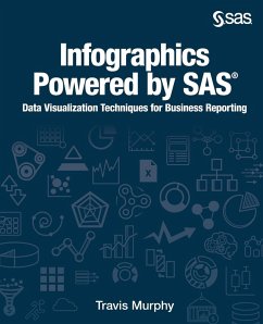
Infographics Powered by SAS
Data Visualization Techniques for Business Reporting
Versandkostenfrei!
Versandfertig in 1-2 Wochen
60,99 €
inkl. MwSt.
Weitere Ausgaben:

PAYBACK Punkte
30 °P sammeln!
Create compelling business infographics with SAS and familiar office productivity tools. A picture is worth a thousand words, but what if there are a billion words? When analyzing big data, you need a picture that cuts through the noise. This is where infographics come in. Infographics are a representation of information in a graphic format designed to make the data easily understandable. With infographics, you don't need deep knowledge of the data. The infographic combines story telling with data and provides the user with an approachable entry point into business data. Infographics Powered b...
Create compelling business infographics with SAS and familiar office productivity tools. A picture is worth a thousand words, but what if there are a billion words? When analyzing big data, you need a picture that cuts through the noise. This is where infographics come in. Infographics are a representation of information in a graphic format designed to make the data easily understandable. With infographics, you don't need deep knowledge of the data. The infographic combines story telling with data and provides the user with an approachable entry point into business data. Infographics Powered by SAS : Data Visualization Techniques for Business Reporting shows you how to create graphics to communicate information and insight from big data in the boardroom and on social media. Learn how to create business infographics for all occasions with SAS and learn how to build a workflow that lets you get the most from your SAS system without having to code anything, unless you want to! This book combines the perfect blend of creative freedom and data governance that comes from leveraging the power of SAS and the familiarity of Microsoft Office. Topics covered in this book include: SAS Visual Analytics SAS Office Analytics SAS/GRAPH software (SAS code examples) Data visualization with SAS Creating reports with SAS Using reports and graphs from SAS to create business presentations Using SAS within Microsoft Office


