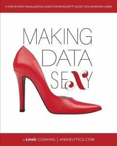
Why Another Excel Book?There are a lot of Excel books on the market. So why write another one?First of all, most Excel books are published in black and white. So they can't focus much (if at all sometimes) on the art of data visualization because you can't say, "Imagine that lighter gray is orange, the dark gray is blue, and the murky gray is...well, that's actually gray. Making Data Sexy is a comprehensive, full-color book with more than 500 screenshots and diagrams and covers 60+ visualizations. It has been created for people who need to learn Excel but don't like to actually read.In addition to learning how to rock the chart types baked into Excel, you will learn how to create charts that aren't offered by Excel. They are created by hacking esoteric settings and chart elements. Some of these hacktastic chart types include: * diverging bar chart * slope chart * dumbbell plot * small multiples * pictograph * floating bar chart * lollipop graph * baseline delta chart * heatmap Companion Chart PickerNeed help picking the best chart for your data? Use the book's companion Chart Picker (whether you purchase or not): makingdatasexy.com/excel/chart-picker/. FeaturesSome of the more notable features of the book include: * There's a version for both PC and Mac users. Mac users are almost always overlooked with Excel books. Not with Making Data Sexy. * The focus is on creating aesthetically pleasing and branded visualizations. You will learn to rid your charts of distracting pixels, such as gridlines, busy axes, etc. And every visualization in the book is created from a three-color palette to demonstrate how to create branded charts. * Tutorials are written in plain English. You will learn the why behind the how in every tutorial, without the geek speak or dryness of a product manual. * The book is scannable. Paragraphs have been replaced with bulleted lists and numbered steps whenever possible to make consumption as easy as possible. * The tone is light. The writing style is fun and even pokes fun at Excel at times, with its Bubblegum-colored crayons and many idiosyncrasies. * Workflows are automated. You'll learn how to create themes, global templates, and chart templates that can be shared across an organization. And you'll learn how to get around some of Excel's downright maddening limitations. Tutorial BreakdownIn chapter 5, where all the chart tutorials are, each chart type is broken down into sections. Some highlights include: * AKA: Learn other names a chart type might go by. * Uses: Learn potential uses for each chart type. * Tips: Learn about potential design gaffes to avoid, pivot table requirements, limitations, and crash warnings. * Category/Metric: Learn the minimum requirements for a chart type. * Tutorial: Learn how to create each chart type with illustrated steps. * Variation(s): Learn how to add finesse some charts with optional enhancements. About the AuthorAnnie Cushing is an analyst who focuses on web analytics and all things marketing. She blogs at Annielytics.com. It started as a joke on Twitter in 2009 and accidentally became a brand.You can learn the backstory behind the book at makingdatasexy.com/about. It's a dramatic story about how Excel embarrassed her and almost caused her to fail a critical web analytics certification course and how she became obsessed with learning Excel and eventually started helping others to learn how to make their data sexy.
Bitte wählen Sie Ihr Anliegen aus.
Rechnungen
Retourenschein anfordern
Bestellstatus
Storno

