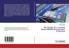
The Design of a Context Aware Mobile Government E-Services
Versandkostenfrei!
Versandfertig in 6-10 Tagen
32,99 €
inkl. MwSt.

PAYBACK Punkte
16 °P sammeln!
The primary design challenge for designing context-aware M-government websites is how to create a good and efficient user experience for a website that appears on screens measuring a few inches taking into account different contexts of use. The literature lacks validated context-aware guidelines for designing mobile versions of E-government websites. Therefore, this study explored the idea if it's set of fifty-nine guidelines collected and filtered from different guidelines within the literature then correlated to the most important elements of context of use, produced a better user experience...
The primary design challenge for designing context-aware M-government websites is how to create a good and efficient user experience for a website that appears on screens measuring a few inches taking into account different contexts of use. The literature lacks validated context-aware guidelines for designing mobile versions of E-government websites. Therefore, this study explored the idea if it's set of fifty-nine guidelines collected and filtered from different guidelines within the literature then correlated to the most important elements of context of use, produced a better user experience than the websites developed using mobile builder tools. To test the guidelines, a comparison was made between the user experience of a mobile version of a local government website designed using the proposed mobile design guidelines with two other mobile versions of the same website developed using two popular mobile web builder tools. The positive results revealed that the human element indesigning user interfaces, be it for the desktop or mobile, cannot be ignored nor automated.


