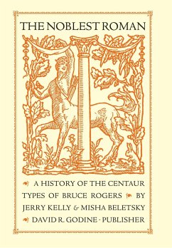
Roughly fifteen years after Gutenberg printed the first substantial book in Mainz in 1455, Nicolas Jenson of Venice produced what has been universally recognized among the most beautiful typefaces ever created. Based on the humanistic calligraphy of the Renaissance, an even and infinitely various set of lowercase letters that had evolved from the Carolingian minuscules of the ninth century, Jenson¿s types were a miracle of proportion and evenness of color. In the late nineteenth century, it was imitated by Morris in his Golden Type of 1892 (far too heavy), and in the next by Cobden-Sanderson with his Doves Type, Goudy with his Deepdene, and Hunter Middleton with his Eusebius. But it was really not until Bruce Rogers, following his stint at the Riverside Press in Cambridge, Massachusetts, where he first attempted a version of the type in his Montaigne font, tackled the challenge of creating a roman equal to (and in some ways surpassing) the Jenson original. The proof of his success is that it has been used, and held in high esteem, ever since. The story behind the type, the many permutations through which it went, the myths that accrued and surrounded it are all exposed in this fully documented account of the type's genesis and development. Often and justly called "the noblest roman of them all," the book has been designed and set in a digital version especially created by Jerry Kelly who, along with co-author Misha Beletsky, have unearthed, mined, and refined a trove of typographic history to create the definitive history of what many consider the most beautiful typeface created by an American in the last century.
Hinweis: Dieser Artikel kann nur an eine deutsche Lieferadresse ausgeliefert werden.
Hinweis: Dieser Artikel kann nur an eine deutsche Lieferadresse ausgeliefert werden.


