- Gebundenes Buch
- Merkliste
- Auf die Merkliste
- Bewerten Bewerten
- Teilen
- Produkt teilen
- Produkterinnerung
- Produkterinnerung
Universal Principles of Typography is a comprehensive, cross-disciplinary encyclopedia for choosing and using type.
Andere Kunden interessierten sich auch für
- Valerie McKeehanThe Complete Book of Chalk Lettering15,99 €
- Toshi OmagariArcade Game Typography18,99 €
- John BoardleyTypographic Firsts28,99 €
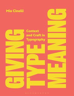
- Mia CinelliGiving Type Meaning23,99 €
- William LidwellUniversal Principles of Design, Updated and Expanded Third Edition24,99 €
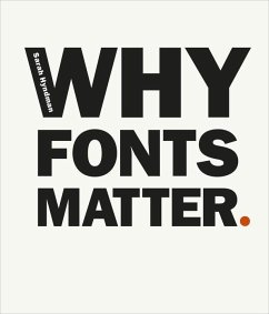
- Sarah HyndmanWhy Fonts Matter16,99 €
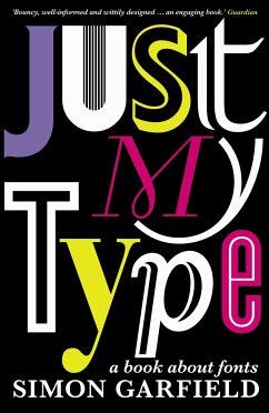
- Simon GarfieldJust My Type11,99 €
-
-
-
Universal Principles of Typography is a comprehensive, cross-disciplinary encyclopedia for choosing and using type.
Hinweis: Dieser Artikel kann nur an eine deutsche Lieferadresse ausgeliefert werden.
Produktdetails
- Produktdetails
- Rockport Universal
- Verlag: Quarto Publishing Group USA Inc
- Seitenzahl: 224
- Erscheinungstermin: 16. April 2024
- Englisch
- Abmessung: 260mm x 221mm x 21mm
- Gewicht: 1022g
- ISBN-13: 9780760383384
- ISBN-10: 0760383383
- Artikelnr.: 68438671
- Herstellerkennzeichnung
- Produktsicherheitsverantwortliche/r
- Europaallee 1
- 36244 Bad Hersfeld
- gpsr@libri.de
Elliot Jay Stocks is a designer and musician, based just outside Bristol, UK. After founding the typography magazine 8 Faces in 2010, Elliot joined Typekit (now known as Adobe Fonts) as Creative Director, and helped lead the service’s transition into desktop fonts and the Creative Cloud ecosystem. He then went on to take several Creative Director roles, all while co-running the lifestyle magazine Lagom with his wife. In 2021, Elliot collaborated with Google to launch the typography education resource Google Fonts Knowledge. He is the author of Universal Principles of Typography (Rockport Publishers, 2024). Over his nearly two-decade career as a designer, Elliot’s work has been profiled in publications such as Communication Arts, Creative Review, Computer Arts, and Page, and he has long been a familiar face at design and tech conferences around the world. Past highlights include TYPO, An Event Apart, South by Southwest, and The Type Directors Club NYC. Today, Elliot focuses exclusively on typographic projects, as well as publishing the newsletter Typographic & Sporadic, and hosting the podcast Hello, Type Friends! He also makes electronic music as Other Form, and releases on several independent labels across Europe. Ellen Lupton is a writer, curator, educator, and designer. She is Senior Curator of Contemporary Design at Cooper Hewitt, Smithsonian Design Museum in New York City. New projects include the books Health Design Thinking and Extra Bold, a feminist career guide for designers. Lupton is founding director of the Graphic Design MFA Program at MICA (Maryland Institute College of Art) in Baltimore, where she has authored numerous books on design processes, including Thinking with Type, Graphic Design Thinking, Graphic Design: The New Basics, and Type on Screen. Her book Design Is Storytelling was published by Cooper Hewitt in 2017. She received the AIGA Gold Medal for Lifetime Achievement in 2007. Recent exhibitions include Face Values: Understanding Artificial Intelligence and Herbert Bayer: Bauhaus Master. The Senses: Design Beyond Vision, Beauty—Cooper Hewitt Design Triennial, How Posters Work, and Beautiful Users. She was named a Fellow of the American Academy of Arts & Sciences in 2019.
Introduction
Alignment
Alternates
Faux or synthesized
Bold
Case
Characters & glyphs
Choosing type
CJK
Classification
Color
Combining
Consistency
Contrast
Control it all with axes
Customization
Dashes
Diacritics
Dissonance
Distinction / asymmetry
Drop caps
OpenType
Emphasis
Expression
Families
Fit
Font development
Font formats
Font vs. typeface
Foundries
Fractions
Variable fonts
Grade
Handwriting
Harmony
Hierarchy
Hinting
Humanism
Icons & symbols
Inclusivity
Installation
It depends
Italics
It’s all about the em square
Justification
Kerning
Legibility
Lettering
Licensing
Ligatures
Line height consistency issues
Line length
Loading
Lock-up
Line height
Masters & interpolation
Metrics
Monospace
Multiplex
Networks
Numerals
Obliques
Optical size
Optical trickery
Pairing type
Parametric axes
Personality
Proportion
Punctuation
Readability
Refinement
Relation
Responsiveness & viewport
Rhythm
Sans serif
Scale
Scripts
Serif
Signage
Size
Small caps
Spacing
Stress
Style
Stylistic sets
Subsetting
Superfamilies
Swashes
Systems
Technical evaluation
Tracking
Type
Type design
Units
Usability
Web fonts
Weight
Widows & orphans
Width
Writing systems
X-height
Acknowledgements
About the Author
Index