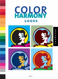
Selecting the right color palette for any design project, whether personal or commercial, can make all the difference in getting it right. But choosing the right colors for a logo, and ultimately the identity, is essential because it will define all the collateral materials that will follow. Unfortunately, for most people choosing colors is not an easy process, but with a little bit of science and a color advice, anyone can make a strong choice.
Color Harmony: Logos opens with a discussion on how to choose color(s) for logos and follows with a number of case studies on logos where color is a dominate factor such as those for H & R Block, Kodak, and Coca-Cola.
Then, it takes the 26 adjectives from one of the series' predecessors, Complete Color Harmony, and shows one logo for each adjective in 60 different color combinations. The result: 1,560 logo variations that illustrate how colors are used.
In all, the book is a powerful demonstration of the power of color and its ability to impact a message.
Dieser Download kann aus rechtlichen Gründen nur mit Rechnungsadresse in A, D ausgeliefert werden.


