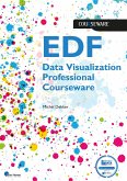
To harness the potential of data, it is crucial for data professionals to present it in a visual format that is both interactive and comprehensible to management and decision makers. The human brain has a strong inclination towards visual information, making data visualization an incredibly powerful tool for the efficient analysis, interpretation, and communication of data. The Data Visualization Practitioner's Guide, functions as textual add on to a Certified Data Visualization Course. The EDF Data Visualization certification demonstrates qualified professionals that have mastered the required skills to visualize data effectively, ensuring that important results will not escape their notice. The training consists of six modules, each with its own weight towards the certification exam: Weight Topic Introduction - Introduction to the data visualization field and basic quantitative thinking. Human perception 20% About the principal components of visual perception, to optimize our visualizations for human consumption. Visualizing data 30% About applying the knowledge of our visual perception to data visualization and the introduction of the CHRTTS model to select chart types. Data viz design 25% About the detailed choices we need to consider when designing our visuals. We also look at the management dashboard and the important role of color. Storytelling 15% How to make use of our capacity to tell and consume stories to process data insights. Workflow 10% How to implement the effective data visualization practices in our daily work.
Dieser Download kann aus rechtlichen Gründen nur mit Rechnungsadresse in A, B, BG, CY, CZ, D, DK, EW, E, FIN, F, GR, HR, H, IRL, I, LT, L, LR, M, NL, PL, P, R, S, SLO, SK ausgeliefert werden.


