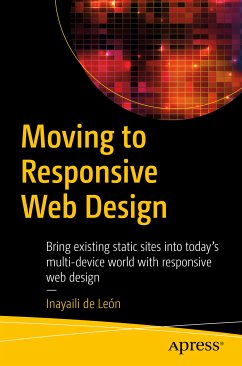
This book shows you how to redesign your static website into a modern, fully responsive site. As the usage of mobile devices continues to increase exponentially and dominates how many users access the web, it is imperative for businesses to have responsive websites that adapt seamlessly to any screen size and resolution. Your shift to a responsive website affects not only your designs but also the way you build your site.
Moving to Responsive Web Design shows you how to address the full range of challenges. You learn to plan how your designs and patterns will adapt across various breakpoints and how to approach the challenge of responsive images. The specific responsive techniques covered in this book include converting fixed grids built on absolute units, such as pixels, into fluid ones, based on relative units like percentages or ems.
When your time and resources are limited, the prospect of converting an existing site to a responsive design can be daunting. But, with this book and the right tools, you can manage the scope of the project from the start and successfully make your site enjoyable on any device. Moving to Responsive Web Design is full of ideas and examples of how you can more easily plan, design, develop, and release your responsively redesigned site.
In this book, you learn how to
- Scope a responsive redesign project so it's achievable with the resources you have available
- Engage the entire team in the planning, design, and development process
- Use your resources in clever and efficient ways
- Focus on reusability to save your team time and money
- Avoid some of the most common problems when working on large and lengthy projects
- Release your first fully responsive site
Dieser Download kann aus rechtlichen Gründen nur mit Rechnungsadresse in A, B, BG, CY, CZ, D, DK, EW, E, FIN, F, GR, HR, H, IRL, I, LT, L, LR, M, NL, PL, P, R, S, SLO, SK ausgeliefert werden.
"This book was written by an expert in the field who has both technical and managerial experiences. It is an easy read and full of tips and wisdom. The book is very concise, only about 150 pages. One can quickly browse it within hours or read it thoroughly in days. Spending that time can help a project leader to foresee potential pitfalls and to avoid unnecessary delays or failure." (Computing Reviews, November, 2017)