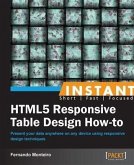
Rapid growth in the use of mobile devices to access the Internet has forced designers to adapt to creating content that is easily viewable on a wide range of different devices. The key is to make images and videos responsive to the platform used, enabling them to be resized automatically when displayed on mobile devices or desktops.This book is a fast-paced, hands-on guide that shows you how to apply some simple techniques to add images and video content to your site, which may be a simple, one-page portfolio, or a complex content management system. The book starts with showing you how to display images. You will learn about browser support and different platforms, and alternatives for high- and low-resolution images. Moving on, the book covers techniques to add responsive video content. You will get to know about adding images and videos and test the media using online sites and tools. The book also explains the use of plugins and responsive frameworks.
Dieser Download kann aus rechtlichen Gründen nur mit Rechnungsadresse in A, B, BG, CY, CZ, D, DK, EW, E, FIN, F, GR, HR, H, IRL, I, LT, L, LR, M, NL, PL, P, R, S, SLO, SK ausgeliefert werden.


