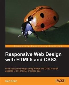
Responsive Web Design Patterns (eBook, PDF)
Sofort per Download lieferbar
20,95 €
inkl. MwSt.

PAYBACK Punkte
10 °P sammeln!
Learn how to build your own pattern library and fill it with the most popular responsive web design patternsAbout This BookExplore the process of combining responsive patterns together to fit the needs of your own website or projectOrganize your projects by creating responsive pattern libraries and manage unruly design systems as they growBreak down the best responsive websites to their patterns and learn how to build them in your own projectsWho This Book Is ForThis book is intended for HTML and CSS beginners who want to know where to start when creating a responsive website. It is also for m...
Learn how to build your own pattern library and fill it with the most popular responsive web design patternsAbout This BookExplore the process of combining responsive patterns together to fit the needs of your own website or projectOrganize your projects by creating responsive pattern libraries and manage unruly design systems as they growBreak down the best responsive websites to their patterns and learn how to build them in your own projectsWho This Book Is ForThis book is intended for HTML and CSS beginners who want to know where to start when creating a responsive website. It is also for more experienced developers who perhaps need a little inspiration for their next project. Knowing what makes a responsive site tick is not enough. You also have to know the best way to design a site that fulfills its required goals, shrinking and stretching to polar sizes all the while. This book aims to equip you with a foundation to do just that.What You Will LearnGain knowledge of the pros and cons of popular responsive patterns.Build each pattern on your own using HTML, CSS, and JavaScript by following examples and guides provided in each chapterKnow how to combine patterns to create unique solutions for your own projectsUnderstand the benefits of creating a pattern library and learn how to use them efficientlyPay attention to detail by reviewing commonly forgotten responsive elements such as typographySee real-world examples of these patterns being used by websites like Disney, NASA, and moreReview techniques and best practices when it comes to building responsive websitesIn DetailResponsive Web Design (RWD) is a web design approach aimed at arranging things in a way to get optimal viewing experience and easy reading and navigation on different screen sizes. It bonds together designers and developers as they publish and test new solutions to build websites for all screen sizes. The simplicity of this technology stems from the fact that learning about the most tested RWD solutions along with basic HTML, CSS, and a bit of JavaScript, can soon help you start using these solutions for yourself. The foundations of RWD, once mastered, will help you gain the skills you need to create your own responsive website.Keep track of Responsive Web Designs (RWD) patterns by building your own pattern library and creating RWD's most popular patterns, seen on hundreds of websites today. For beginners and pros, this book provides a toolset to help plan the design and functionality of a responsive website.The book begins with creating a home for all your patterns by setting up your own pattern library. Each chapter is broken down into different sections of a website; presenting patterns for each section. We move on to building responsive layouts of varying degrees of complexity to house the type of content you need. Develop menu systems and see which responsive navigation fits the size of your website. Next, you'll learn tactics to present media and data elegantly on different screen sizes. And finally, you'll tie up all those loose ends on your responsive website and pattern library to get it ready for launch.Style and approachThis book is a collection of favored responsive patterns broken down to be easily understood and recreated. Each chapter focuses on a specific part of a website, from large to small, and shows you the markup and styles behind it. A responsive pattern library accompanies this book that you can download and see the patterns and your code beforehand.
Dieser Download kann aus rechtlichen Gründen nur mit Rechnungsadresse in A, B, BG, CY, CZ, D, DK, EW, E, FIN, F, GR, HR, H, IRL, I, LT, L, LR, M, NL, PL, P, R, S, SLO, SK ausgeliefert werden.


