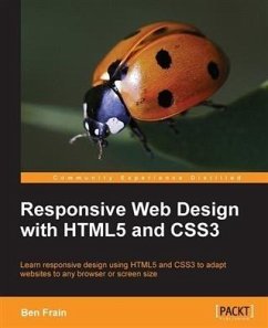
In DetailTablets, smart phones and even televisions are being used increasingly to view the web. There's never been a greater range of screen sizes and associated user experiences to consider. Web pages built to be responsive provide the best possible version of their content to match the viewing devices of not just today's devices but tomorrow's too.Learn how to design websites according to the new "e;responsive design"e; methodology, allowing a website to display beautifully on every screen size. Follow along, building and enhancing a responsive web design with HTML5 and CSS3. The book provides a practical understanding of these new technologies and techniques that are set to be the future of front-end web development. Starting with a static Photoshop composite, create a website with HTML5 and CSS3 which is flexible depending on the viewer's screen size.With HTML5, pages are leaner and more semantic. A fluid grid design and CSS3 media queries means designs can flex and adapt for any screen size. Beautiful backgrounds, box-shadows and animations will be added - all using the power, simplicity and flexibility of CSS3.Responsive web design with HTML5 and CSS3 provides the necessary knowledge to ensure your projects won't just be built 'right' for today but also the future.ApproachThis book will lead you, step by step and with illustrative screenshots, through a real exampleWho this book is forAre you writing two websites - one for mobile and one for larger displays? Or perhaps you've heard of Responsive Design but are unsure how to bring HTML5, CSS3, or responsive design all together. If so, this book provides everything you need to take your web pages to the next level - before all your competitors do!
Dieser Download kann aus rechtlichen Gründen nur mit Rechnungsadresse in A, B, BG, CY, CZ, D, DK, EW, E, FIN, F, GR, HR, H, IRL, I, LT, L, LR, M, NL, PL, P, R, S, SLO, SK ausgeliefert werden.
Hinweis: Dieser Artikel kann nur an eine deutsche Lieferadresse ausgeliefert werden.

