Sie sind bereits eingeloggt. Klicken Sie auf 2. tolino select Abo, um fortzufahren.
Bitte loggen Sie sich zunächst in Ihr Kundenkonto ein oder registrieren Sie sich bei bücher.de, um das eBook-Abo tolino select nutzen zu können.
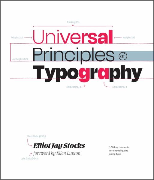
Explore 100 key concepts, theories, and guidelines that are critical for choosing and using type. We communicate with text every single day, but what does it mean to really understand type-to use it with clear intent and purpose? The art and science of typography combines subtle tweaks to line lengths with harmonious combinations of weights and styles; considered typeface pairings with a robust set of alternate characters; exciting technological advances with the realities of font licensing. There are so many ways designers can optimize how text is read and influence the way its message is…mehr
Explore 100 key concepts, theories, and guidelines that are critical for choosing and using type. We communicate with text every single day, but what does it mean to really understand type-to use it with clear intent and purpose? The art and science of typography combines subtle tweaks to line lengths with harmonious combinations of weights and styles; considered typeface pairings with a robust set of alternate characters; exciting technological advances with the realities of font licensing. There are so many ways designers can optimize how text is read and influence the way its message is understood-and yet so many designers miscommunicate without even realizing it. Richly illustrated and easy to navigate, Universal Principles of Typographypairs clear explanations of each principle with visual examples of it applied in practice. By considering these concepts and examples, you can learn to make more informed, and ultimately better, typography decisions. Building upon tried-and-tested principles from the world of print through to the very latest advances in browser technology, this book will equip you with everything you need to make the most informed typographic decisions in your design work today. Featured principles are as diverse as:
Characters & Glyphs
Font v. Typeface
Hierarchy
Inclusivity
OpenType
Pairing type
Rhythm
Web fonts
Each principle is presented in a two-page format. The first page contains a succinct definition, a full description of the principle, examples of its use, and guidelines for use. Sidenotes appear with the text, and provide elaborations and references. The next page contains visual examples and related graphics to support a deeper understanding of the principle. With Universal Principles of Typography, gain a deep understanding of the universal principles of typography and learn how to apply them across any work you do with type, from the simplest of documents to the most complex of cross-platform design systems. The titles in the Rockport Universal series offer comprehensive and authoritative information and edifying and inspiring visual examples on multidisciplinary subjects for designers, architects, engineers, students, and anyone who is interested in expanding and enriching their design knowledge.
Dieser Download kann aus rechtlichen Gründen nur mit Rechnungsadresse in A, D ausgeliefert werden.
Die Herstellerinformationen sind derzeit nicht verfügbar.
Autorenporträt
Elliot Jay Stocks is a designer and musician, based just outside Bristol, UK. After founding the typography magazine 8 Faces in 2010, Elliot joined Typekit (now known as Adobe Fonts) as Creative Director, and helped lead the service's transition into desktop fonts and the Creative Cloud ecosystem. He then went on to take several Creative Director roles, all while co-running the lifestyle magazine Lagom with his wife. In 2021, Elliot collaborated with Google to launch the typography education resource Google Fonts Knowledge. He is the author of Universal Principles of Typography (Rockport Publishers, 2024).Over his nearly two-decade career as a designer, Elliot's work has been profiled in publications such as Communication Arts, Creative Review, Computer Arts, and Page, and he has long been a familiar face at design and tech conferences around the world. Past highlights include TYPO, An Event Apart, South by Southwest, and The Type Directors Club NYC.Today, Elliot focuses exclusively on typographic projects, as well as publishing the newsletter Typographic & Sporadic, and hosting the podcast Hello, Type Friends! He also makes electronic music as Other Form, and releases on several independent labels across Europe.
Inhaltsangabe
Introduction Alignment Alternates Faux or synthesized Bold Case Characters & glyphs Choosing type CJK Classification Color Combining Consistency Contrast Control it all with axes Customization Dashes Diacritics Dissonance Distinction / asymmetry Drop caps OpenType Emphasis Expression Families Fit Font development Font formats Font vs. typeface Foundries Fractions Variable fonts Grade Handwriting Harmony Hierarchy Hinting Humanism Icons & symbols Inclusivity Installation It depends Italics It’s all about the em square Justification Kerning Legibility Lettering Licensing Ligatures Line height consistency issues Line length Loading Lock-up Line height Masters & interpolation Metrics Monospace Multiplex Networks Numerals Obliques Optical size Optical trickery Pairing type Parametric axes Personality Proportion Punctuation Readability Refinement Relation Responsiveness & viewport Rhythm Sans serif Scale Scripts Serif Signage Size Small caps Spacing Stress Style Stylistic sets Subsetting Superfamilies Swashes Systems Technical evaluation Tracking Type Type design Units Usability Web fonts Weight Widows & orphans Width Writing systems X-height Acknowledgements About the Author Index
Es gelten unsere Allgemeinen Geschäftsbedingungen: www.buecher.de/agb
Impressum
www.buecher.de ist ein Internetauftritt der buecher.de internetstores GmbH
Geschäftsführung: Monica Sawhney | Roland Kölbl | Günter Hilger
Sitz der Gesellschaft: Batheyer Straße 115 - 117, 58099 Hagen
Postanschrift: Bürgermeister-Wegele-Str. 12, 86167 Augsburg
Amtsgericht Hagen HRB 13257
Steuernummer: 321/5800/1497
USt-IdNr: DE450055826