Visible Numbers (eBook, ePUB)
Essays on the History of Statistical Graphics
Redaktion: Kimball, Miles A.; Kostelnick, Charles
Versandkostenfrei!
Sofort per Download lieferbar
48,95 €
inkl. MwSt.
Weitere Ausgaben:

PAYBACK Punkte
24 °P sammeln!
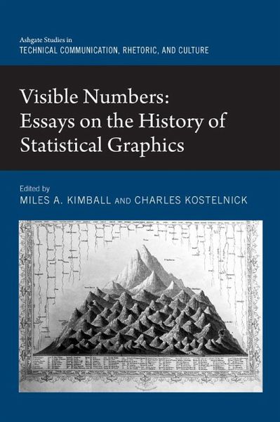
Bringing together scholars from around the world, this collection examines many of the historical developments in making data visible through charts, graphs, thematic maps, and now interactive displays. Today, we are used to seeing data portrayed in a dizzying array of graphic forms. Virtually any quantified knowledge, from social and physical science to engineering and medicine, as well as business, government, or personal activity, has been visualized. Yet the methods of making data visible are relatively new innovations, most stemming from eighteenth- and nineteenth-century innovations that...
Bringing together scholars from around the world, this collection examines many of the historical developments in making data visible through charts, graphs, thematic maps, and now interactive displays. Today, we are used to seeing data portrayed in a dizzying array of graphic forms. Virtually any quantified knowledge, from social and physical science to engineering and medicine, as well as business, government, or personal activity, has been visualized. Yet the methods of making data visible are relatively new innovations, most stemming from eighteenth- and nineteenth-century innovations that arose as a logical response to a growing desire to quantify everything-from science, economics, and industry to population, health, and crime. Innovators such as Playfair, Alexander von Humboldt, Heinrich Berghaus, John Snow, Florence Nightingale, Francis Galton, and Charles Minard began to develop graphical methods to make data and their relations more visible. In the twentieth century, data design became both increasingly specialized within new and existing disciplines-science, engineering, social science, and medicine-and at the same time became further democratized, with new forms that make statistical, business, and government data more accessible to the public. At the close of the twentieth century and the beginning of the twenty-first, an explosion in interactive digital data design has exponentially increased our access to data. The contributors analyze this fascinating history through a variety of critical approaches, including visual rhetoric, visual culture, genre theory, and fully contextualized historical scholarship.
Dieser Download kann aus rechtlichen Gründen nur mit Rechnungsadresse in A, B, BG, CY, CZ, D, DK, EW, E, FIN, F, GR, HR, H, IRL, I, LT, L, LR, M, NL, PL, P, R, S, SLO, SK ausgeliefert werden.


