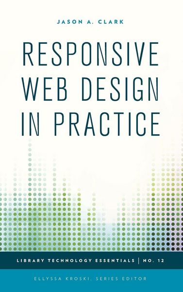
Responsive Web Design in Practice
-
- Hardcover ausgewählt
- Taschenbuch
- eBook
-
Sprache:Englisch
136,99 €
inkl. gesetzl. MwSt.,
Beschreibung
Produktdetails
Einband
Gebundene Ausgabe
Erscheinungsdatum
04.09.2015
Verlag
Rowman & LittlefieldSeitenzahl
150
Maße (L/B/H)
23,5/15,7/1,3 cm
Gewicht
378 g
Sprache
Englisch
ISBN
978-1-4422-4368-2
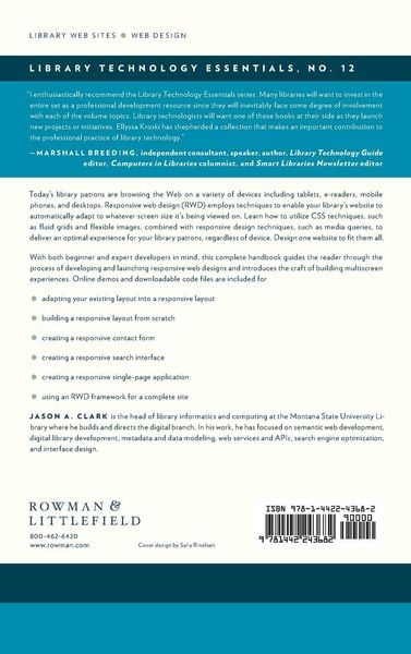
Today's library patrons are browsing the Web on a variety of devices including tablets, e-readers, mobile phones, and desktops. Responsive web design employs techniques that will enable your library's website to automatically adapt to whatever screen size it's being viewed on. Learn how to utilize CSS techniques such as fluid grids and flexible images combined with responsive design techniques such as media queries to deliver an optimal experience for your library patrons regardless of device. Design one website to fit them all. With both beginner and expert developers in mind, this complete handbook guides the reader through the process of developing and launching their own Responsive Web Designs and introduces the craft of building multi-screen experiences. Online demos and downloadable code files are included for all projects: Adapting your Existing Layout into a Responsive Layout - A RWD Retrofit Building a Responsive Layout from Scratch - A RWD Bookreader Creating a Responsive Contact Form - "Get a Library Card" Creating a Responsive Search Interface Creating a Responsive Single Page Application - "Mobile Feed App" Using an RWD Framework for a complete site: Twitter Bootstrap
Noch keine Bewertungen vorhanden
Verfassen Sie die erste Bewertung zu diesem Artikel
Helfen Sie anderen Kundinnen und Kunden durch Ihre Meinung.
Kurze Frage zu unserer Seite
Vielen Dank für dein Feedback
Wir nutzen dein Feedback, um unsere Produktseiten zu verbessern. Bitte habe Verständnis, dass wir dir keine Rückmeldung geben können. Falls du Kontakt mit uns aufnehmen möchtest, kannst du dich aber gerne an unseren Kund*innenservice wenden.
zum Kundenservice